
The Rise of Warm Neutral Paint Colors in North Carolina Homes
Walk through any neighborhood in Concord, Kannapolis, or Harrisburg right now, and you’ll notice something shifting. The cool grays and stark whites that dominated home exteriors and interiors a decade ago are quietly giving way to something warmer — richer taupes, soft creamy beiges, earthy tans, and muted terracottas. This isn’t just a passing trend. It’s a deliberate response to how we live, how light moves through our homes, and what genuinely looks good in this part of North Carolina.
As a professional painter working across Cabarrus County and the surrounding communities, I’ve watched this shift happen job by job. Homeowners are making more intentional choices about color, and warm neutrals are consistently at the top of the list. Here’s why — and how to make them work in your home.
Why Warm Neutrals Are Taking Over in Cabarrus County
The Light Here Is Different
North Carolina’s light has a quality that not everyone talks about but every painter learns to respect. In the Piedmont region — which includes Concord, Mount Pleasant, Midland, and Locust — we get bright, warm sunlight for much of the year, filtered through humidity and surrounded by red-clay soil and Southern foliage. That environment rewards warm-toned paint.
Cool gray walls that look sleek in a Pacific Northwest showroom can appear dull, flat, or even slightly purple in a south-facing Concord living room at midday. Warm neutrals, on the other hand, absorb and reflect that natural light beautifully. They glow. They settle in. They make a room feel like it belongs in this climate rather than fighting against it.
The Red Clay Effect
If you’ve spent any time in Cabarrus County, you know the red-orange clay that shows up in every construction site, every garden bed, and every rural road shoulder. That clay sets a visual tone for the landscape, and homes that harmonize with it tend to look more grounded and intentional.
Warm neutral paint colors — especially those with tan, sand, or terracotta undertones — naturally echo the earth tones already present in the local environment. It’s not a coincidence that a soft greige or warm linen color looks stunning against a brick home in Harrisburg or a wood-accented craftsman in the Mount Pleasant area. The landscape is already doing half the work.
Buyer Preferences Are Shifting
Across Huntersville and the greater Lake Norman corridor down into Cabarrus County, the housing market has welcomed tens of thousands of new residents over the past several years. Many of these buyers are coming from larger metros where the design aesthetic has moved decidedly toward organic, nature-forward palettes. Warm neutrals fit that preference perfectly.
Real estate professionals in the area consistently note that homes with warm, neutral interiors photograph better, feel more welcoming during showings, and appeal to a wider range of buyers. For homeowners thinking about resale — or simply about enjoying their space more — warm neutrals deliver on both counts.
Where Warm Neutrals Work Best in Local Homes
Interiors: Room by Room
Not every warm neutral works in every room, and the undertone matters more than most people realize. Here’s a practical breakdown:
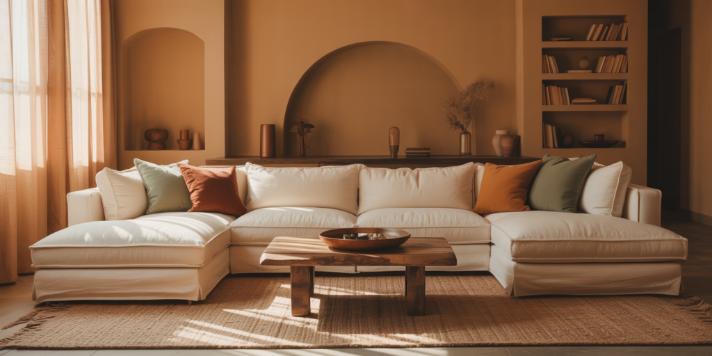
- Living rooms and open-plan areas: Creamy whites and soft taupes with yellow or beige undertones work exceptionally well. They create warmth without overwhelming a large space. Colors in the soft white to greige range perform particularly well when north-facing rooms need to feel lighter.
- Bedrooms: Warm tans and dusty mauve-neutrals add coziness without feeling heavy. These shades help a room feel restful, which is exactly what a bedroom should do.
- Kitchens: Warm whites and linen tones complement wood cabinetry — common in both older Concord homes and new Kannapolis builds — far better than cool whites, which can make wood grain look orange by contrast.
- Bathrooms: Soft sand and warm greige tones work well here. In smaller bathrooms with limited natural light, choose a warm neutral with higher LRV (light reflectance value) to keep the space from feeling closed in.
Exteriors: Traditional Homes and New Construction
Cabarrus County has a mix of traditional brick ranches, 1980s and 90s vinyl-sided homes, and newer craftsman-style and farmhouse builds. Warm neutrals adapt to all three.
| Exterior Style | Recommended Warm Neutral Direction | Notes |
|---|---|---|
| Brick ranch (older construction) | Warm tan, linen, or greige siding | Complements existing red or brown brick tones |
| Vinyl-sided homes | Soft beige, warm white, or sandy taupe | Avoids the “plastic” look of harsh cool whites |
| Craftsman / farmhouse new builds | Earthy khaki, warm charcoal-taupe | Pairs well with dark trim and natural wood accents |
| Traditional two-story colonials | Creamy white or warm ivory | Classic look that holds up well in direct sunlight |
For exteriors, pay close attention to how a color looks in full afternoon sun — which, in the Piedmont, tends to be intense. What looks like a subtle tan on a color chip can read quite saturated on a full south-facing wall.
What to Watch for: Undertones and Common Mistakes
Undertones Make or Break the Color
This is where most DIY color selections go wrong. Every neutral has an undertone — a hidden hue that becomes visible under certain lighting conditions. Common undertones in warm neutrals include:
- Yellow/gold: Looks bright and cheerful; can feel dated in some rooms
- Pink/mauve: Soft and subtle; works beautifully in bedrooms and formal areas
- Green/olive: Earthy and organic; common in greiges; can clash with warm wood tones
- Orange/rust: Pairs naturally with NC clay surroundings but can dominate smaller rooms
The best practice is to test large sample swatches — at least 12 by 12 inches — directly on your wall. Leave them up for 48 hours and observe them at different times of day, especially morning light and evening artificial light. What looks warm and inviting at noon can appear muddy or orange under LED lighting at 8 p.m.
Don’t Go Too Warm in Already-Warm Rooms
A south-facing sunroom in a Harrisburg home that already gets intense afternoon light doesn’t need a deep golden tan on the walls. In those spaces, a lighter, more muted warm neutral — think pale linen or soft warm white — lets the natural light do the work without making the room feel like the inside of a kiln.
Choosing the Right Shades for Your Home
Here are a few practical starting points to guide your selection:
- Start with your fixed elements. Flooring, cabinetry, countertops, and brick are already in place. Pull warm neutral paint options that share at least one undertone with those materials.
- Consider your trim color. Warm wall colors pair best with warm whites on trim. A cool, bright white trim against a warm tan wall creates visual tension that makes both colors look off.
- Test before you commit. In Cabarrus County’s varied light conditions — from the tree-shaded lots in Midland to the open, sun-drenched subdivisions near Concord Mills — paint behaves differently. There’s no substitute for testing in your specific space.
- Think about the exterior as a whole. Roof color, shutters, brick, and stone all factor in. A warm neutral that works on one home can look flat on another if the supporting elements tell a different color story.
The Bottom Line
Warm neutral paint colors are rising in popularity across Concord, Kannapolis, Harrisburg, and the broader Cabarrus County area for good reasons. They work with the local light, they complement the natural surroundings, and they create the kind of grounded, welcoming spaces that both homeowners and buyers respond to. But getting the most from a warm neutral takes more than just picking a beige off a chip rack.
Pay attention to undertones, test your colors in context, and think about how every fixed element in your space interacts with your paint choice. When you get it right, a warm neutral doesn’t just cover your walls — it transforms how your home feels, inside and out.
If you’re planning a paint project in the Concord, NC area and want to talk through color selection before you commit to a single drop of paint, that conversation is always worth having before you start rolling.
Learn more about Color World Painting Charlotte.
